Details
Chart data
The details page displays the energy flows at the location in a chart view. Actions based on energy prices, for example by a linked energy trader, are also shown here.
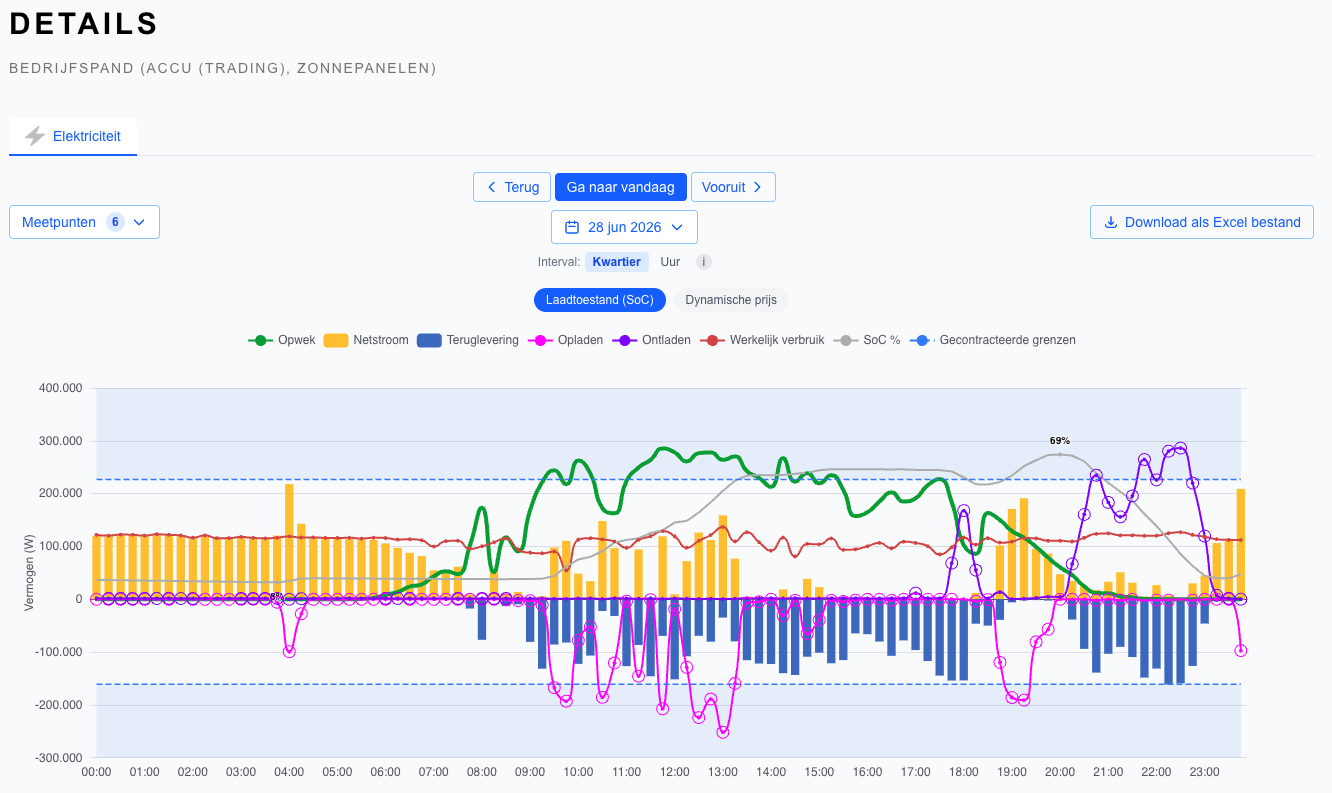
The legend indicates what the coloured data in the chart means. Control actions based on prices, both by a third party and by Envitron, are displayed by means of the coloured dots in the chart. It is possible to switch between displaying the average battery percentage and the dynamic energy prices by making a selection in the top left of the chart.
Clicking on the data in the chart zooms in to minute level. Other time levels (week, month, year) can also be selected by clicking on the dropdown menus at the top of the chart.
Historical energy data can be downloaded in common formats such as .csv and Excel via the button in the top right of the view.
Table data
The details page also displays a summary of the energy performance of the currently selected time period per connected device, as shown in the example table below.
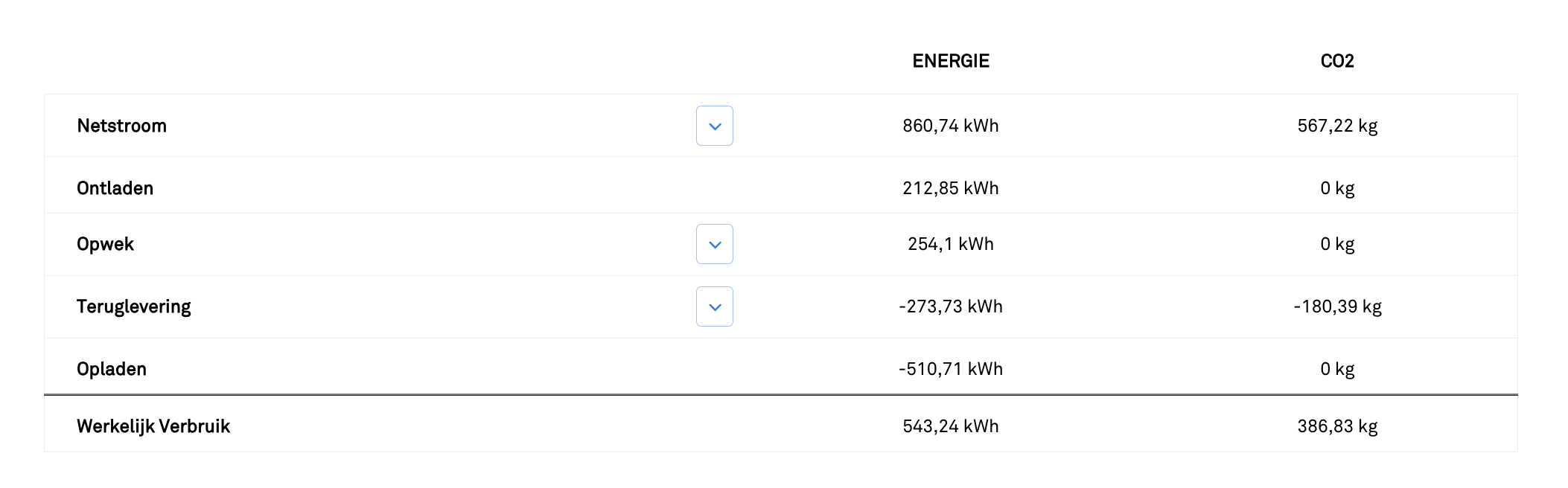
Please note: the data displayed here is a calculation of the (aggregated) power values we receive from the devices. Because the data is grouped here at minute level and calculated from power data, it is possible that the meter readings in this table differ slightly from the meter readings under the building.